|
|
|
Curators Picks: December 2 The Signet/New American Library Collection of Paperback Art Showcase Auction
|
 |

|
Sarahjane's Picks
Sarahjane Blum | Director of Illustration Art
|
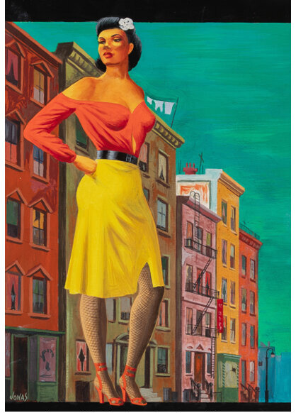
The Street was among the earliest paperbacks published by Signet,
appearing soon after the imprint's launch. For the cover, Robert Jonas, best
remembered today for his surrealist designs for Penguin Books, created a
haunting modernist image that draws on the visual language of Social Realism.
Ann Petry's unflinching novel of a single mother in Harlem during World War II
became a literary sensation, breaking ground as the first book by a Black
female author to sell more than a million copies. This striking, bold cover art
mirrors the novel's powerful and challenging story and, to me, embodies
Signet's early mission to bring significant literature to a broad American
readership.
|
|
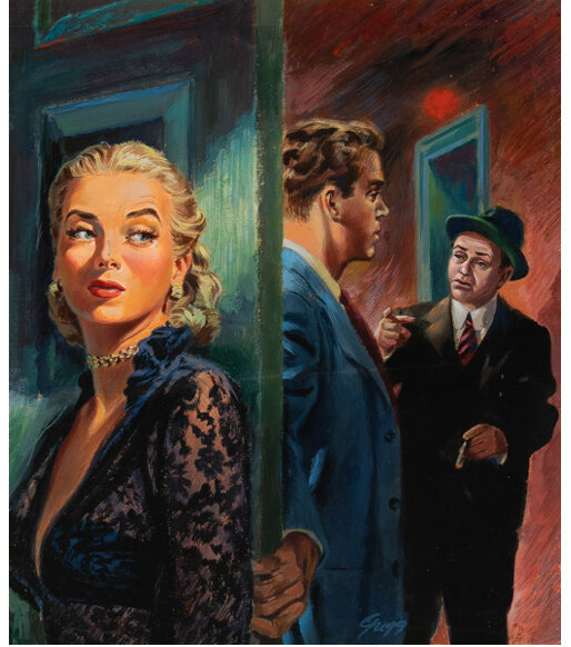
Double Indemnity first appeared as a serial in
Liberty magazine in 1936, before being published as a novella in James M.
Cain's Three of a Kind. It was quickly adapted into one of the most
significant film noir thrillers of the 20th century, with a screenplay by
Raymond Chandler. For this 1950 standalone paperback edition, Gerald Gregg drew
inspiration from Billy Wilder's film. The male figures clearly resemble Edward
G. Robinson and Fred MacMurray, though Gregg seems to have lacked enthusiasm
for Barbara Stanwyck's iconic bangs. Looking at this cover art, I'm reminded of
the synergy between hard-boiled detective fiction and film noir, and of the legends
who created a universe that mirrored the anxieties of modern life while making
them as seductive as a platinum-blonde femme fatale.
|
|
I'm one of generations of Americans whose first introduction
to Shakespeare was through a battered paperback with a Milton Glaser cover,
handed out by a English teacher with the make-or-break
opportunity to get a classroom to understand, even love the Bard. Glaser helped
them along the way, with his shockingly interpretive covers that made something
old feel new again. Glaser's work for the Signet Shakespeare series is among
his most legacy-making design, and it's an honor to bring Othello to
auction for the first time.
|
|

|
Meagen's Picks
Meagen McMillan | Senior Consignment Director, Illustration Art
|
The James Bond 007 franchise is essential to the pop culture
of the late 20th century. Signet's releases of these books
further reinforced Bond's grip on the zeitgeist. Goldfinger solidified
Ian Fleming's formula for the modern spy thriller, blending espionage, luxury,
and larger-than-life villains. Barye Phillips effortlessly captured the allure,
danger, and sophistication of Bond's world, helping to shape the visual identity
of the series for mid-20th-century readers and filmgoers.
|
|
|
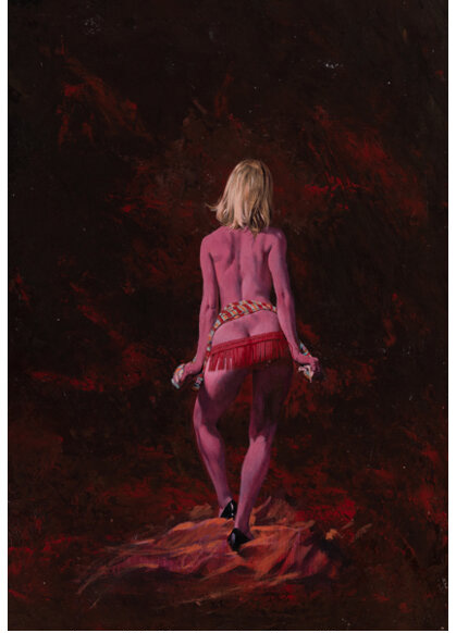
With The Wayward Wahine we
were faced with our own mystery - the case of the McGinnis woman in disguise.
As specialists, we are often handed artwork that does not quite match the cover
of the published book or magazine, and we must uncover what was changed, how,
and why. In this case, we had an original artwork that was at once identical
to, yet clearly different from, what readers saw when
they picked up the Carter Brown mystery. The body of the figure, from the
shadows of her back to the highlights of her toes, was a perfect match to the
cover, but the hair and skirt were completely different. Then we saw it: a thin
red line to the right of the grass skirt, both in the published book and in the
painting itself. The publisher had added an overlay to change the hair color
and lengthen the skirt but had failed to fully cover the original hula skirt.
Most likely, the outfit was considered a little too risqué for open display. A
quick fix by Signet, but they wisely left McGinnis's beautiful original
untouched. Case closed - mystery solved by a thin red line.
|
|
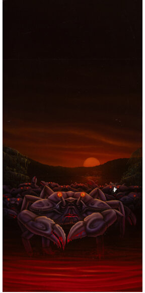
Sometimes life gives you lemons, sometimes it gives you
1970s British horror slasher book covers about Killer Crabs. I have
always enjoyed absurdity and camp in equal amounts and
this excellent example cannot be missed. Artist Don Brautigam truly was coming
into his own during this period and would go on to become one of the top horror
and thriller cover illustrators as well as creating the art for Metallica's Master
of Puppets and many other 20th century metal classics.
|
|

|
Ezriel's Picks
Ezriel Wilson | Cataloguer, Fine Art
|
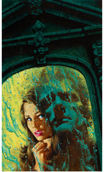
I couldn't be more excited about the Gothic Romance we have
in this sale. With so many great works, it was hard to choose just one,
but The Secret of the Chateau just keeps catching my eye.
Maybe it's the color green and the fantastic rendering
of the rain-soaked window combined with the reflection of a mysterious male
figure. Maybe it's the striking female figure in ¾ profile, curiously
peering-not quite frightened but a little alarmed. Whatever the reason, I need to
read about this isolated chateau of terrifying noises and mysterious
disappearances. I also may need to pick up the forthcoming hardcover edition
of Spectral Vision of Gothic Romance: Vintage Occult 1960s Art which
includes The Secret of the Chateau in its survey of the
genre. Add it to your collection if you dare!
|
|
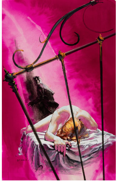
I am a huge fan of the drama captured in oil by Robert Emil
Schulz in his cover for The Case of the Dead Divorcee! In the work,
a nude female figure appears as though she has been thrown upon a bed as a
dark, looming figure sneaks away-a dark scar on the vibrant pink background.
Schulz's manipulation of space with the tilted wrought-iron bed frame and the
slab-like bed gives the overall feel of the viewer looking in on a jarring
scene one only sees by accident. The viewer becomes a witness, giving this work
a combination of whodunit intrigue with the enticing energy of a racy pulp.
Schulz created something to not only grab the reader's attention but to leave
them wanting more.
|
|
|
|
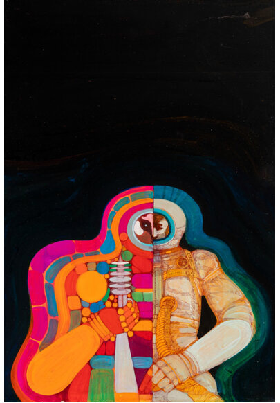
Another exciting part of this sale has been not only the
variety of art but also the technical skill in the use of mixed media by the
artists. A wonderful example from this auction is the colorful paperback cover
by David McCall Johnston for Tomorrow 1, a collection of works by
science fiction masters. I was incredibly taken by the striking details and
excellent line work in this piece. Science fiction book
covers of the 1960s and 70s were generally surreal and thought-provoking, with
bright, psychedelic colors. Johnston's approach really made me wonder if he
might also be making a symbolic jab at the logic of the right, creative side of
the brain versus the left, analytical side. In the work, the figure's left side
appears meticulously lined out in ink, every detail in the figure's features
and suit visible, while the right side is drawn out but covered in colorfully
psychedelic bubble blocks. Through the careful laying of lines and layering of
colors, David McCall Johnston created a work that caught more than just your
eye on the bookshelf.
|
|
|
|
|
Meagen McMillan
Senior Consignment Director,
Illustration Art
MeagenM@HA.com
(214) 409-1546
|
|
|
|
|
|
|
|
|
|