|
|
|
Curators' Picks: April 23 Prints & Multiples Signature Auction
|
 |

|
Frank's Picks
Frank Hettig | Vice President, Modern & Contemporary Art, Dallas
|
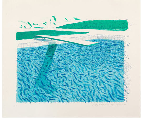
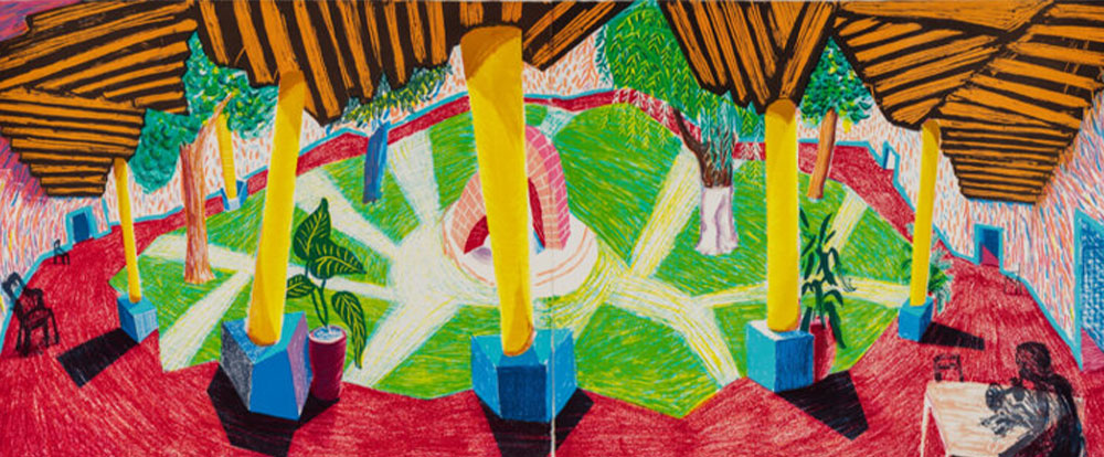
David Hockney's Lithograph "Water Made of Lines, Crayon and
Two Blue Washes" has always intrigued me for the way it transforms something as
fluid and elusive as water into a carefully constructed visual language. Rather
than painting water realistically, Hockney builds it out of lines, marks, and
layered washes of blue. Even the title feels almost
like a set of instructions, as if he's letting you in on exactly how the image
is built.
|
|
|
|
|
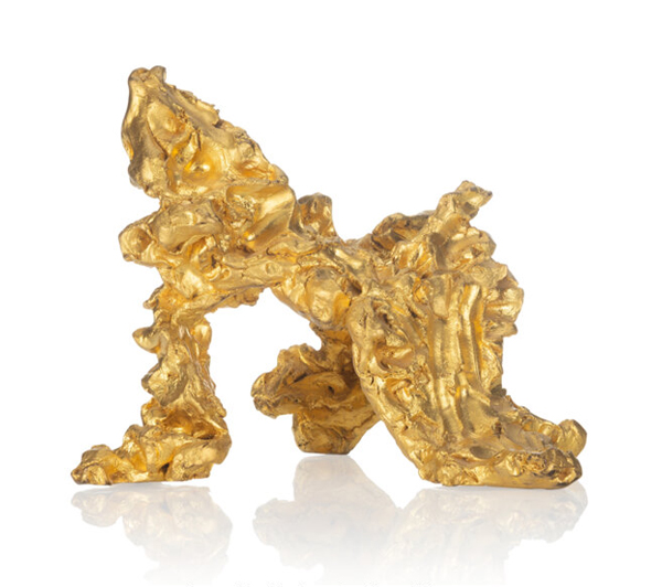
There's something about "Ghost Dance" by Linda Benglis that
feels almost alive to me, like it's caught mid-movement. The surface is so
tactile-you can almost feel where Benglis pushed and shaped it with her
hands-and that sense of touch makes it feel really immediate and
physical. I love how the gold leaf catches the light, giving it this strange
mix of weight and weightlessness, like it's both solid and somehow shifting at
the same time.
Tuttle's Swift Confirmation seems to be doing similar things
in completely different ways. Benglis's piece feels physical and
expressive-like a gesture that's been pressed into bronze, still carrying the
energy of her hands. Tuttle's work, on the other hand, feels much quieter and
more internal. It's smaller, more subtle, but it has this sense of a moment
just coming into being-like an idea or feeling taking shape for the first time.
In a way, both works are about transformation.
|
|

|
Holly's Picks
Vice President, Modern & Contemporary Art, San Francisco
|
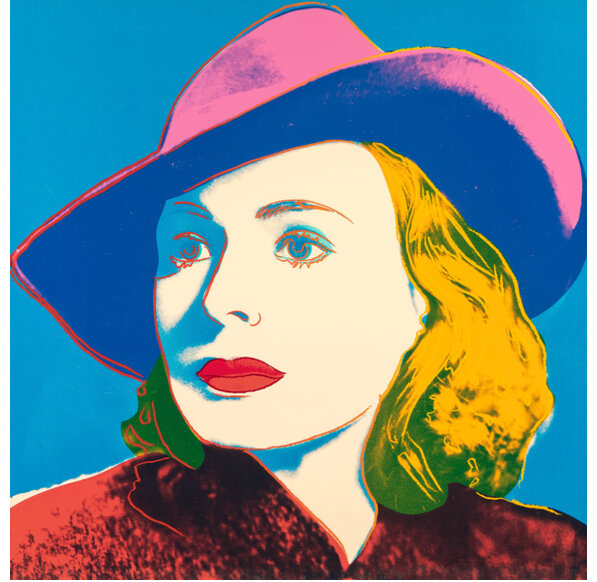
Ingrid Bergman with Hat (1983) is based on a
film still from Casablanca, an image embedded in the visual culture
of cinema. Produced shortly after Bergman's death and late in Warhol's career,
the work belongs to a period in which he returned to film stars with renewed
focus, consolidating ideas that had defined his practice since the 1960s.
Warhol consistently used publicity images, recasting portraiture as something
shaped by mass media and reproduction. As in his portraits of Marilyn Monroe
and Elizabeth Taylor, Bergman is presented as a figure inseparable from her
image, her identity formed through circulation. In keeping with his broader
engagement with mortality, from the Death and Disaster series
onward, the work holds in tension the persistence of the image and the absence
of the person, fixing a fleeting cinematic moment as an enduring cultural form.
|
|
|
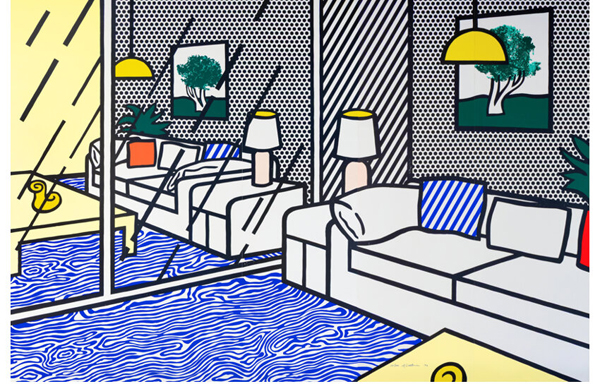
I had the privilege of visiting Gemini G.E.L. in the early
1990s while Wallpaper with Blue Floor Interior was in progress
and recall seeing scraps in the studio trash marked with Lichtenstein's
handwritten notes. I was tempted to rescue them, though of course I didn't, a
moment that revealed the close collaboration between artist and printers.
Completed in 1992, the work extends across five vertical panels, each over
eight feet high and together more than twelve feet wide. Its production
required numerous screens, multiple printers, and exact registration across all
panels. The composition draws on imagery from furniture catalogs, rendered in
Ben-Day dots and sharply defined lines. Installed in a living room, the work
creates a doubling effect, placing a constructed interior within a real one and
collapsing the distinction between lived space and its constructed image.
Influenced by artists such as Matisse, Lichtenstein reconsiders the interior
through the logic of mechanical reproduction, using scale, panels, and layers
to construct an image that operates as an architectural space rather than
a picture.
|
|

|
Rebecca's Picks
Rebecca Lax | Consignment Director, Prints & Multiples, New York
|
|
|
|
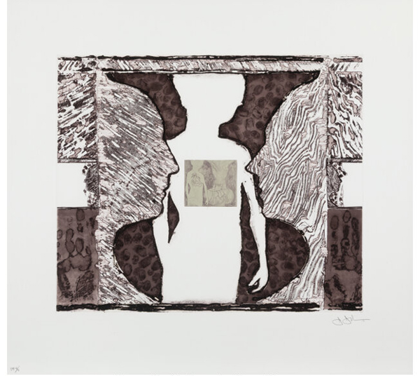
In this auction, we offer two prints from Jasper
Johns' Shrinky Dink series. Rendered in subtle palettes, these
intaglio etchings highlight Johns' meticulous and highly sophisticated plate
work.
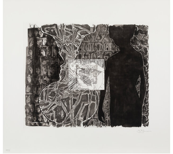
The silhouetted boy in both compositions is a
self-referential image of the artist as a young child, derived from his Four
Seasons etchings, also published by Universal Limited Art Editions
(ULAE), New York, in 1987. Johns' imagery is rooted in reflection, spanning the
biographical, art historical, and cosmological. References to Holbein,
Grünewald, and Picasso appear throughout.
The restrained palette of black, gray, and sepia emphasizes
the intricacy of the etched surfaces. In Shrinky Dink 2, handprints
flank the central image while thumbprints activate the background. In Shrinky
Dink 1, Johns incorporates key motifs from his oeuvre: stars referencing
the American flag, a reversed alphabet, and the classic positive-negative
profile illusion forming a vase shape, alongside delicate sign language
imagery. The male and female profiles are of the artist's family members,
usually in honor of his grandparents who raised him from childhood.
ULAE is one of the preeminent print publishers and workshops
in the world, established by Tatyana Grosman (1904-1982) in 1957, and was
instrumental in Johns' early engagement with printmaking. Much of the ULAE
print archive has been acquired by, and is now held in the permanent
collections of, the Museum of Modern Art, New York, and the Art Institute of
Chicago.
|
|
|
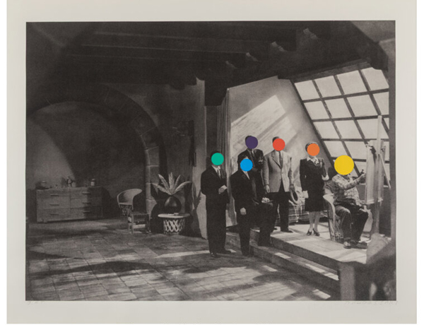
John Baldessari's Studio print distills
many of the artist's core concerns: authorship, the mechanics of art-making,
and the quiet absurdity of the studio itself as both a physical and conceptual
space. Rather than presenting the studio as a romantic site of inspiration, Baldessari
treats it as a self-critical, analytical environment, with a line of "critics"
and potential dealers standing behind the creator at his easel.
Baldessari often incorporates photographic imagery from
Hollywood films (he had an archive of still), text, and his iconic use of flat,
colorful dots as a form of censorship. His dots obscure photographic faces,
creating an immediate censure of identity and meaning. The result is a kind of
visual deadpan, where humor and critique operate simultaneously.
In Baldessari's hands, the studio becomes less a sanctuary
of creativity and more a stage for questioning how art is produced and
understood. He emphasizes selection and arrangement, shifting the role of the
artist from maker to editor. Studio reflects a broader
conceptual strategy that defined Baldessari's practice: the idea that meaning
in art is not inherent, but constructed, contingent, and often slightly
ridiculous.
Please see the two other Baldessari prints we have in the
auction, from the Stonehenge series published and printed by Mixografía® and if you seek more biographical
information on the artist, watch this video, narrated by Tom Waits, A Brief History of John
Baldessari (YouTube)
|
|

|
Desiree's Picks
Consignment Director, Prints & Multiples, Beverly Hills
|
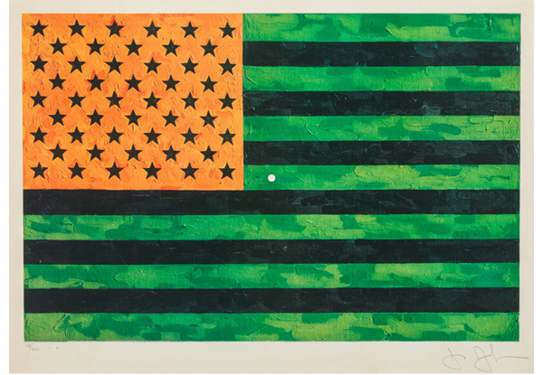
This is one of my favorite works by Jasper Johns because of
how it invites the viewer to participate in an optical game. Flag incorporates
a small white dot at the center that activates a striking optical afterimage.
When the viewer fixes their gaze on this dot and then looks away, especially at
a blank wall, the complementary colors of the altered flag reconfigure in the
eye, producing the illusion of a more "correct" red, white, and blue American
flag. This effect turns the act of seeing into a participatory experience,
where the image is completed not on the canvas but in the viewer's vision. By
doing so, Johns blurs the boundary between object and perception, suggesting
that even familiar symbols like the flag are not fixed, but contingent on how
and where we look.
|
|
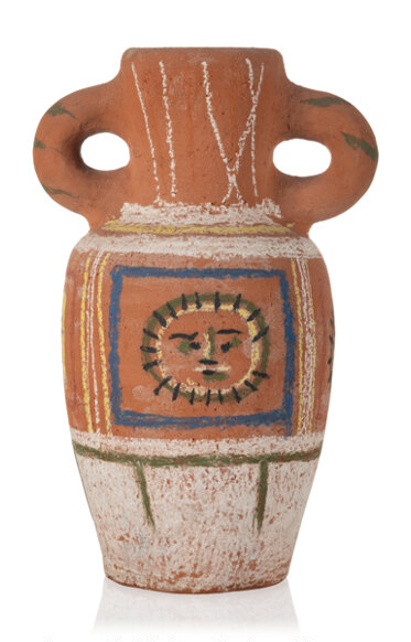
Picasso's Vase au décor pastel exemplifies
his inventive approach to ceramics, where he treats the vessel not just as a
functional object but as a surface for painterly experimentation. On the front,
Picasso paints a stylized face, using fluid lines that echo his broader
exploration of portraiture across media. The soft pastel decoration wraps
around the form, integrating this visage with the contours of the vase so that
image and object become inseparable. Both playful and expressive, the face
animates the vessel, transforming it into a character-like presence while
blurring the boundary between sculpture, painting, and everyday object.
|
|

|
Taylor's Picks
Taylor Curry | Director, Modern & Contemporary Art, New York
|
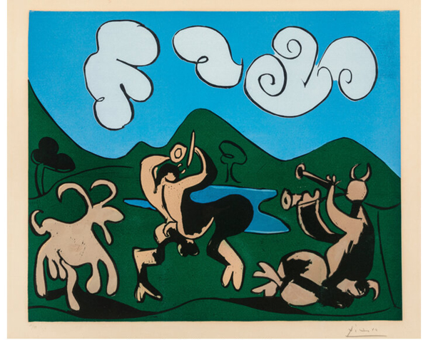
Picasso's linocuts from Vallauris,
created between 1950 and the early 1960s with master printer Hidalgo Arnéra,
mark a key moment in his printmaking. This example Faunes et chèvre stands
out for its rich, saturated inks and velvety surface, highlighting the
innovation and painterly quality that define this body of work, and it would
fit seamlessly into any collection.
|
|
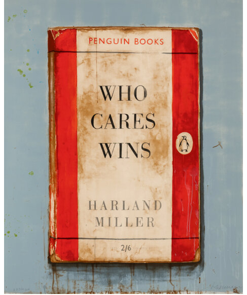
Harland Miller's Who Cares
Wins (Large) (2014) sits firmly within his most recognizable series,
where he reworks the classic Penguin cover into bold, text-based compositions.
The scale matters here. It gives the work a real presence, with clean,
saturated color and that crisp screenprinted finish.
The phrase itself is classic Miller. Dry, slightly ironic, but not without a
hint of sincerity. It lands quickly and sticks.
This is a sharp, highly recognizable example with real
impact on the wall, and exactly the kind of piece collectors tend to gravitate
toward within this body of work.
|
|

|
Walter's Picks
Walter Ramirez | Consignment Director, Modern & Contemporary Art, New York
|
|
|
|
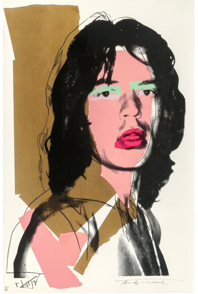
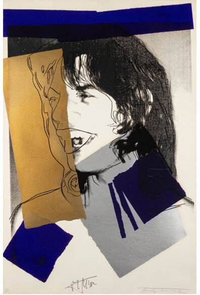
Andy Warhol's Mick Jagger prints are among the most
compelling examples of his ability to merge celebrity culture with fine art,
making them both visually striking and highly sought after by collectors.
Created in 1975, the series captures Jagger's charisma through bold lines,
vibrant colors, and Warhol's signature screenprinting technique.
Each print is hand-signed by Jagger, adding a collaborative element that blurs
the line between subject and artist. The works feel immediate and energetic,
embodying the spirit of 1970s rock culture while maintaining Warhol's cool,
graphic precision. Their appeal lies not only in their visual impact but also
in their cultural significance, bringing together two icons at the height of
their influence and yielding works that remain historically important and
consistently sought after in the art market.
|
|
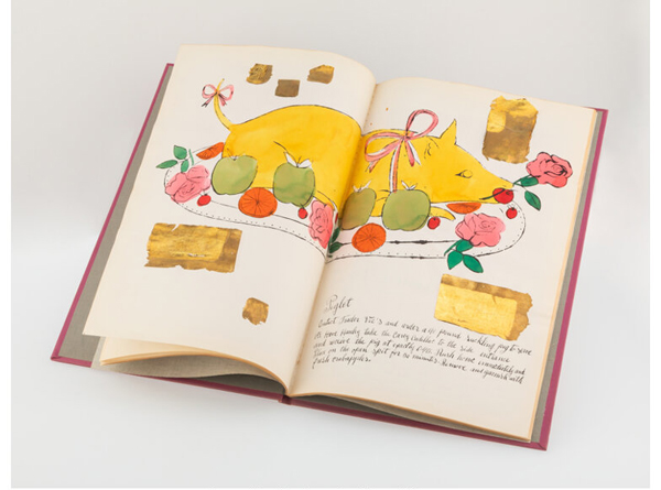
Andy Warhol's Wild Raspberries is a rare and engaging
example of his early work, highlighting the playful wit and creativity that
would later define his career. Created in 1959 with
Suzie Frankfurt, the artist's book features 18 offset lithographs, many
enhanced with hand coloring and collage, paired with humorous recipes that
gently parody mid-century haute cuisine. With lettering by Warhol's mother,
Julia Warhola, the book blurs the line between fine art and design. Both
whimsical and visually refined, Wild Raspberries offers a glimpse into Warhol's
early career while hinting at his later interest in consumer culture. Its
rarity, charm, and historical significance make it especially desirable among
collectors.
|
|

|
Hannah's Picks
Hannah Ziesmann | Cataloger and Associate Specialist, Fine Arts, Dallas
|
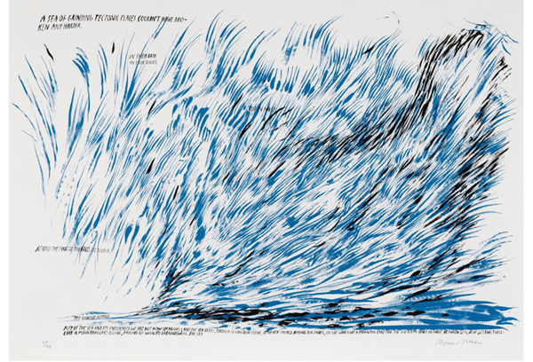
A surge of ink, restless and salt-stung, dashes across the
paper in Pettibon's unmistakable hand - part drawing, part thought, part
weather system. Blue and black strokes lash and recoil like surf caught
mid-crash, but beneath their fluidity lies something more seismic: a sea
imagined as "a sea of grinding tectonic plates," where motion is not only
surface but deep-time collision. In lithography - a medium itself born of
pressure and resistance - this tension feels especially apt, as if the image
has been pressed into being by unseen forces shifting below. His text,
half-whispered and half-declared, drifts through the composition like a voice
carried on wind - elliptical, knowing, and a little haunted. The sea here is
not just a subject but a temperament: volatile, seductive, edged with menace,
forever cresting, collapsing, and beginning again.
|
|
|
|
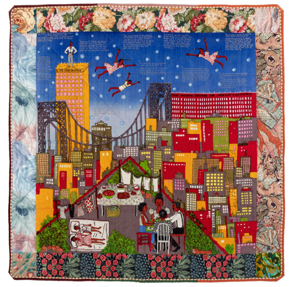
There is a softness to Tar Beach 2 that
extends beyond fabric and thread - a softness that seems to remember you,
to hold your weight, your dreams, your story with quiet care. Faith Ringgold's
quilt wraps us in more than cloth: it enfolds us in memory, community, and
possibility, its layered surface - screenprint, text, and hand-stitched
quilting - carrying the warmth of collective making rooted in Black American
traditions. At its center, Cassie Louise Lightfoot, the story's main character,
soars above Harlem on a star-filled night, her outstretched arms lifting her
beyond the George Washington Bridge and the limits of the world below. In
Ringgold's vision, flight is never mere fantasy - it is a radical reimagining
of freedom, where the rooftop "tar beach," once a site of gathering and constraint,
becomes a place of joy and launch. The work's radiant colors and careful
stitching holds together a generation of voices - women who created,
nurtured, and imagined beyond boundaries - reminding us that memory and
possibility are, like the quilt itself, inseparably woven together.
|
|
Find these and other outstanding modern and contemporary prints in Heritage's Prints & Multiples Signature Auction. The auction's session is 11:00 AM Central Time, Thursday, April 23.
Sincerely,
|

|
|
Frank Hettig
Vice President, Modern & Contemporary Art
Dallas
FrankH@HA.com
(214) 409-1157
|

|
|
Holly Sherratt
Vice President, Modern & Contemporary Art,
San Francisco
HollyS@HA.com
(415) 548-5921
|

|
|
Desiree Pakravan
Consignment Director,
Prints & Multiples,
Beverly Hills
DesireeP@HA.com
(310) 492-8621
|
|

|
|
Rebecca Lax
Consignment Director,
Prints & Multiples,
New York
BeckyL@HA.com
(212) 486-3736
|

|
|
Taylor Curry
Director,
Modern & Contemporary Art,
New York
WalterC@HA.com
(212) 486-3503
|

|
|
Walter Ramirez
Senior Consignment Director,
Urban Art,
New York
WalterR@HA.com
(212) 486-3521
|

|
|
Hannah Ziesmann
Cataloger and Associate Specialist,
Fine Arts, Dallas
HannahZ@HA.com
(214) 409-1162
|
|
|
|
|
|
|
|
|
|