UReader
Brands
Sign in
Sign up
Newsletter Search Engine
Dates
2025 (205704)
2026 (61298)
2024 (51094)
Business Categories
General
(101071)
Other
(57744)
Home
(22216)
Fashion
(21229)
Electronics
(16762)
Literature
(11287)
Sports
(11231)
Art
(8611)
Machinery
(5031)
Health
(4683)
Food
(2946)
Country
GLOBAL
(36756)
CO
(19599)
NL
(17347)
AU
(17023)
GB
(15005)
NZ
(15005)
US
(13686)
BE
(13246)
DE
(8982)
FI
(8686)
CL
(7749)
CA
(7520)
PL
(7373)
RO
(7193)
ES
(6793)
HU
(6566)
ZA
(6502)
AR
(6093)
IL
(5995)
DK
(5680)
FR
(5364)
SK
(5262)
BR
(5212)
HR
(5134)
IT
(5011)
CZ
(4688)
PT
(4526)
SE
(4525)
IE
(3910)
GR
(3848)
NO
(3832)
SG
(3180)
CH
(3094)
BG
(2945)
RU
(2660)
MY
(2314)
UA
(2290)
MX
(2203)
AT
(2150)
JP
(2143)
PE
(1867)
RS
(1797)
TR
(764)
VE
(761)
IO
(677)
TW
(593)
ID
(590)
PK
(579)
IQ
(551)
HK
(500)
MA
(476)
PH
(449)
TV
(413)
AE
(323)
TH
(255)
KW
(188)
KP
(108)
VN
(54)
EG
(42)
IN
(8)
KZ
(4)
MD
(2)
NU
(2)
LT
(1)
BA
(1)
LK
(1)
Total 318096 mails
toypanic
MY
·
2026-6-23
ToyPanic Preorder & In-Stock - 23/06/2026
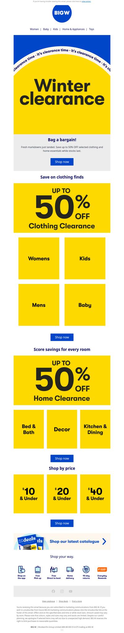
bigw
AU
·
2026-6-23
Clearance: Up to 50% OFF Home & Clothing
flowerstore
PH
·
2026-6-23
Never miss another birthday — Mid-Year Sale is live 🔔
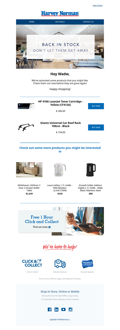
harveynorman
NZ
·
2026-6-23
THEY'RE BACK! We restocked our most-wanted items.
opticsplanet
GLOBAL
·
2026-6-23
🦅 14% OFF Firearm Parts 🔫
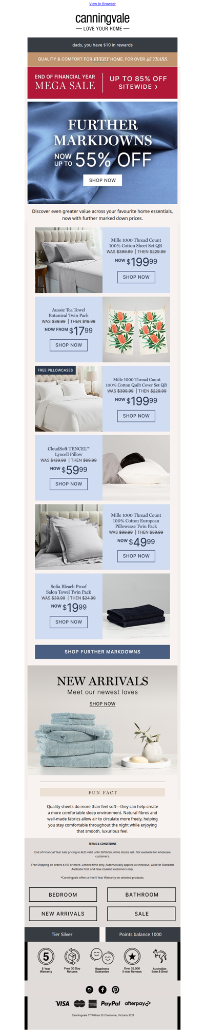
canningvale
GLOBAL
·
2026-6-23
Further markdowns now up to 55% off
esh2u
MY
·
2026-6-23
💥4️⃣ DAYS ONLY‼ ESH SS2 Mega Clearance Carnival — Up to 90% OFF!*
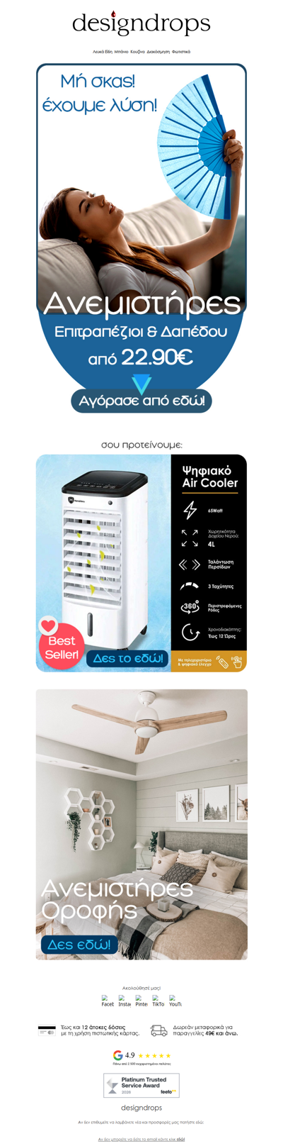
mydesigndrops
GR
·
2026-6-23
🥵Μη σκας❗️Ανεμιστήρες από 22.90€ στο designdrops❄️
tescoma
CZ
·
2026-6-23
Tady je vaše sleva!
westelm
GLOBAL
·
2026-6-23
Now live: 1,000+ new arrivals
nitecorelights
SG
·
2026-6-23
Gear Drop: No Sockets on the Mountain
prezzee
AU
·
2026-6-23
Get road-ready this winter with Supercheap Auto
1
2
3
4
5
©2024 UReader
Home
Brands
Marked Emails
Followed Brands
Privacy Policy & User Agreement